CDD Research : The History Of The Album Cover
The first disc records, ones that we would recognize as such, appeared around 1910. Most often these were packaged in plain brown Paper or cardboard sleeves. Occasionally and enterprising retailer would print his store name on the sleeve but generally they were unadorned.
In the early 1920's retailers started gathering many of these cardboard sleeves and binding them together with heavy paperboard or leather covers. These looked similar to large photo albums and, borrowing the name, were sold as record albums. These albums offered much greater protection for the discs than the original packaging and were seen as indispensable to disc owners that had seen too many of their fragile records broken.


Beginning in the 1930s the record companies started using these record albums to distribute bundles of records from one performer or a collection of performers with similar musical styles. Some of the first cover designs can be traced to these albums and the record company’s desire to graphically communicate the music each album held.

Alex Steinweiss the art director for Columbia Records is given credit for the concept of modern cover art. He experimented with different concepts and images through the late 1930s and into the early 1940s. During this time Columbia Records rebounded from the terrible years they had suffered during the depression to become one of the most prominent record companies in the United States. Much of this was due to their ground breaking use of graphical design. By the close of the decade all major recording companies had graphic design professionals on staff.

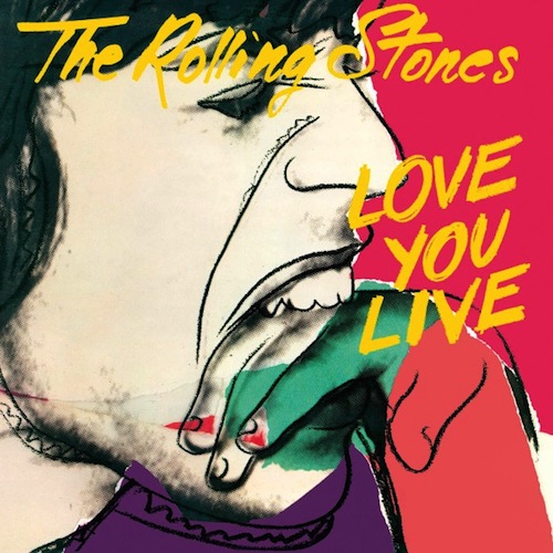
The golden era of cover art design began in the early to mid 1960s and lasted into the early 1980s. During this time the major format for music was the 12 inch, long play disc or LP. Cover art became a part of the musical culture of the time. Often used to express graphically the musician’s artistic intent, it helped connect and communicate to listeners the message or underlying theme of the album.


Designers, photographers, and illustrators sometimes became famous for their cover art creations. Such notables as Andy Warhol and Frank Frazetta were taken from being known in their industry to becoming household names due to their cover art graphic design work. So respected and desired are the designs and illustrations found in cover art that there are numerous art galleries that specialize in helping collectors find rare album covers.
As the medium for recording transitioned from the LP to the compact disc many graphic designers failed to transition with it. Having worked for so long with the much larger canvas of the LP cover, switching to the smaller CD case left most designers dissatisfied with their results. Often artist and record companies simply tried to shrink the LP size art to fit the CD.

Album cover art, now almost exclusively CD and CD packaging artwork, went through a period of change and rebirth in the 1990s. Designers learned to capture snapshots and portions of the artist’s musical intent rather than trying to convey the entire message. Also designers started conveying the emotion of the music rather than the musical intent.
In the late 90s computer design programs started to overcome the physical limitations of the smaller CD packaging. With the ability to draw much tighter, finer lines and have even small details look crisp and sharp, once again designers were free to explore a larger variety of design options. As the technology continued to improve graphic designers adapted and were once again producing world class artwork.


In the present, CD design is undergoing a true renaissance. Rather than becoming obsolete in the digital age as many thought it would, graphic design is once again proving itself as the difference maker. The internet is now the largest record store imaginable. Now rather than browsing a few hundred albums or songs at a time you may be exposed to thousands and thousands. Since it would be impossible to listen to portions of all those thousands of songs the design of the accompanying artwork must cause potential listeners to stop and take notice and give this album a try.

CLICK HERE to watch a video which provides an interesting take on the implications of album artwork in relation to marketing.
Album Covers : Research Into Existing Products

In this task we were given a task to look at six CD's and see what conventions we could find. We made notes about what we found as you can see in the picture above. Some of the conventions that we found were not surprising, such as the album name and artist(s) on the front cover and also a picture of some kind on the front page.


Here we are, in a group of two, looking at these CD' and writing down the conventions that we can find so we can refer back to it whilst making our album cover. We looked at the front cover, the back cover, the inner front, the inner back and the spine to see what things are similar between the CD's and also what things are different.
Overall it was very interesting to see what conventions there are on these as we will follow these conventions when creating our own album covers. From this task I now know what I need to add to my album cover to follow the conventions and make it look like the real deal. From this task I now know that I will need to add a barcode on the back of my CD Digipack as we found the convention that all CD's have them. This is the same with small print, I will need to add this to the back or spine of my Digipack as the CD's we looked at had this.
CDD Research : Analysing An Existing 4 Panel Digipack


Another existing digipack

This task was very similar to the previous task, which was to look at the conventions of six CDs, however this time I was given the challenge to go through a similar task but this time look at them in much more detail and analyse the codes that I could find on the digipack 'I'll Keep Calling'.
Planning: CD Digipack Front Cover Audience Feedback
I roughly drew some pictures of potential CD Digipack front covers and asked some of my class mates to look at them and choose which is their favourite layout and why.
This is my personal favourite lay out for the front cover and I think that it will be the favourite choice.


After looking at the rough drawings for a front cover design the audience decided that they like the top design the most. They said the reason that they like it is because it is easy for them to see who the album is by and also the album name as it is at the top of the cover. They also like the idea of having a picture of the artist on the cover so they can easily recognise who sings it if they didn't know the name but could recognise the face of the artist. The use of the field in the background goes well with the music magazine advertisement and links them together. Here they are looking at the three designs and discussing what they like and dislike about each of them.

Evidence of CD digipack production: Frank Hamilton - "Summer"

To start with i imported the template in which i would be using for the digipack. This allowed me to get the correct dimensions for if it was to be used as a real CD digipack. I started off with the front cover.


So the first thing that i did was to add the same background as the music magazine advert. This was becasue i feel as if it looks better if the same image is used instead of a differentsetting all together. As you can see i then added a picture of the main artist and fit him into the corner so i had the rest of the front cover to put things such as text and other images as well.
 The next thing that i did was to add the artist name as this is one of the conventions that were on all of the other digipacks. I did this by selecting a part of the field and duplicating that part of the field and adding that to a new layer. I then typed out the text what i wanted and made sure the text layer was below the empty field layer. I thenright clicked on the field layer and clicked create clipping mask which added this effect to the text.

The next thing that i did was to add the album name underneath the artist name and this was in the same text as the artist name just this text was slightly bigger so it would fill most of the empty gap in the sky. This was the finished front cover to the digipack.

The next thing that i did was to do the back cover. I started with the same picture as the front cover but it has been flipped to make it look like it is carrying on from the front cover as one of the conventions is that the pictures link in some way.

The next thing that i did was to add the younger version of Frank into the back cover. I decided to do it this way so that it would link to the music video throughout. I have faded this out and changed the opacity of that because it was the past and so i feel as if it looks better faded out slightly.

The next thing that i did was to add the names of the songs which would be on the album when it does get released. I ended up with 7 songs on the digipack and these are the most popular songs that Frank Hamilton has.

I have know added a clipping mast onto the text that is in the sky. And will now take part of the sky and will put it over the text that is below the sky.

I then added another clipping mask over the top of the 3 of the bottom songs. I used the sky as the field wouldnt have appeared on the cover as that is where the field begins and this is why i chose the sky. You can also see the bar code as this is one of the codes and conventions that are on every digipack. There is also small print on there as well saying about the copyright.
For the inside cover i have left them plain but it still has links to the outside as it is the same field that has been used for the front and back cover. One thing that i have also done to the inside cover is that it is the full length of the image and none of it has been cut off. I have also blurred the inside covers so it isnt exactly the same and you struggle to realise it is the same picture.
Below you can see the final product:

 The next thing that i did was to add the artist name as this is one of the conventions that were on all of the other digipacks. I did this by selecting a part of the field and duplicating that part of the field and adding that to a new layer. I then typed out the text what i wanted and made sure the text layer was below the empty field layer. I thenright clicked on the field layer and clicked create clipping mask which added this effect to the text.
The next thing that i did was to add the album name underneath the artist name and this was in the same text as the artist name just this text was slightly bigger so it would fill most of the empty gap in the sky. This was the finished front cover to the digipack.

The next thing that i did was to do the back cover. I started with the same picture as the front cover but it has been flipped to make it look like it is carrying on from the front cover as one of the conventions is that the pictures link in some way.

The next thing that i did was to add the younger version of Frank into the back cover. I decided to do it this way so that it would link to the music video throughout. I have faded this out and changed the opacity of that because it was the past and so i feel as if it looks better faded out slightly.
The next thing that i did was to add the names of the songs which would be on the album when it does get released. I ended up with 7 songs on the digipack and these are the most popular songs that Frank Hamilton has.
I have know added a clipping mast onto the text that is in the sky. And will now take part of the sky and will put it over the text that is below the sky.

I then added another clipping mask over the top of the 3 of the bottom songs. I used the sky as the field wouldnt have appeared on the cover as that is where the field begins and this is why i chose the sky. You can also see the bar code as this is one of the codes and conventions that are on every digipack. There is also small print on there as well saying about the copyright.
For the inside cover i have left them plain but it still has links to the outside as it is the same field that has been used for the front and back cover. One thing that i have also done to the inside cover is that it is the full length of the image and none of it has been cut off. I have also blurred the inside covers so it isnt exactly the same and you struggle to realise it is the same picture.
Below you can see the final product:

No comments:
Post a Comment